Blog Makeover: Taste & Travel Connoisseurs
 It’s Makeover Monday — today we’re reviewing Lee Block’s blog, “The Taste and Travel Connoisseurs.” I’ll give some suggestions for ways Lee can improve her blog, and then it’s up to her to either:
- make do-it-yourself improvements
- hire the team at Blogging Bistro to do it for her (we have talented graphic designers and developers in our stable who work wonders on Web sites and blogs)
- do nothing. But that wouldn’t be right!
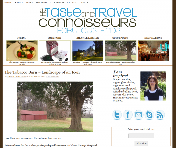
First, let’s take a peek at a screenshot of Lee’s blog:

Theme of Lee’s blog:
The Travel Connoisseurs focuses on where to drink, where to eat and where to stay, or as I like to call it: cocktails, cuisine and accommodations.
At a glance:
The second I saw your blog, I knew I was in for a treat. The thumbnail images headlined “Cuisine,” “Cocktails,” “Creative Lodging,” “Guest Posts,” and “Destinations” let me know exactly what to expect from you.
The “Destinations” image is a Flash-style slideshow that highlights recent posts. I found myself staring at it to see what your next teaser would be, and I clicked several of the images because I was intrigued to learn more. You hooked me!
The one element that jarred me was your typographical logo. I like the typography; it’s funky (although you might be able to ditch the “fabulous finds” tagline). But it doesn’t match the classic fonts used throughout the rest of your site. You might consult with a graphic designer to see how you can change the conflicting elements to create a more cohesive feel.
Sidebar Content:
Your sidebar contains essential elements every blog should have:
- A brief bio and nice image of you (readers connect more quickly with the blogger when you include a picture of yourself).
- Links to your key social media accounts.
- Two ways for people to subscribe to your latest blog posts (e-mail and RSS feed reader)
- Site Search form
You’ve also included some “bonus” sidebar elements:
- Recent tweets
- Facebook “Like my Page” box
- Several ads (are you generating income from these ads? If not, I suggest axing them because they add clutter).
Bottom of Home page:
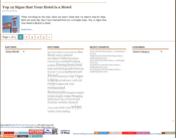
The elements near the bottom of your page concern me. One, they’re hard to read (the type size in the Recent Comments widget is teensy and hard for me to see). Two, they’re not needed. Especially all the links to blog directories at the bottom.
Here’s a screenshot:

If I had to keep one element, it would be the Categories widget. While you do list your major Categories in the images at the top of your Home page, you have an extensive list of categories. Since it’s a drop-down menu and doesn’t take up much space, I’d move it into the righthand sidebar, below “Search Our Site.”
I also suggest shrinking the width of the sidebar and widening the main content area. The two columns are close to the same width, which makes my eyes wonder where they should look first. Most bloggers want to steer readers to the main content area, where the articles are, and thus, they make that column wider.
Main Content Area
You neatly organize your archived blog articles with a clickable thumbnail image and a brief excerpt. This allows you to feature more articles on your blog’s front page.
You do an excellent job of writing keyword-rich, searchable (optimized) headlines.
I like your WP Greetbox plugin (when you click on a post to Read More, it displays the post’s image and the following message:
Welcome to The Travel Connoisseurs! If you are new here, you might want to subscribe to the RSS feed for updates on this topic.
Although I’ve heard about Greetbox, I haven’t seen it used on a blog until now. I’d love to know whether it results in lots of new RSS subscribers.
Site Navigation
Your WordPress site includes several additional pages, but the navigation buttons are at the very top of your site, above your logo. They’re quite small, and I didn’t see them at first.
I suggest evaluating your site’s analytics to see how many people are visiting the various pages on your site. If they aren’t clicking on your other pages as much as you’d like them to, you should consider enlarging or repositioning the buttons so visitors can easily discover them.
Overall, Lee, I think you’ve got a great site going. You cover interesting topics, and you stick very closely to your theme. I’m now a fan!
P.S. Be sure to read Lee Block’s guest column for Blogging Bistro: The Best Way for a Blogger to Connect with the Press

Leave a Reply